


Custom Map Styles: Design a Map That Matches Your Brand
The map is the biggest visual element in your video, which makes custom map styles the fastest way to make an animation look like yours instead of a screen recording of a navigation app. This guide shows you how to work the Mappi Style panel: when to lean on a preset, how to recolor land, water, roads, borders, and labels to match a brand, and how to keep the result readable while the camera moves. The same workflow powers everything from travel edits to a branded real estate map for a listing video.
Start from a preset, not a blank map
A map style is a system of a dozen coordinated color decisions, and presets exist because those decisions are already balanced against each other. Land and water contrast enough to read at low zoom, roads sit above terrain without shouting, labels survive on top of everything. When you restyle from scratch, you inherit all of those balancing problems at once. The professional workflow is to pick the preset closest to your target mood, then override only the colors that matter for your brand. Two or three deliberate changes on a solid preset almost always beats a fully hand-built style, and it takes a tenth of the time. Presets are also safer under motion: they have already been tested across zoom levels, so the camera can travel from a continental wide shot to a street arrival without the palette breaking somewhere in between.
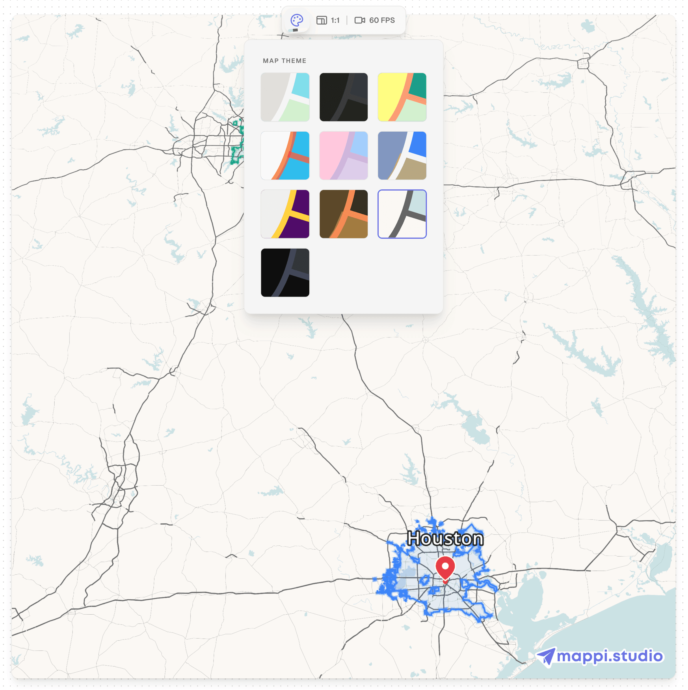
Build custom map styles in five steps
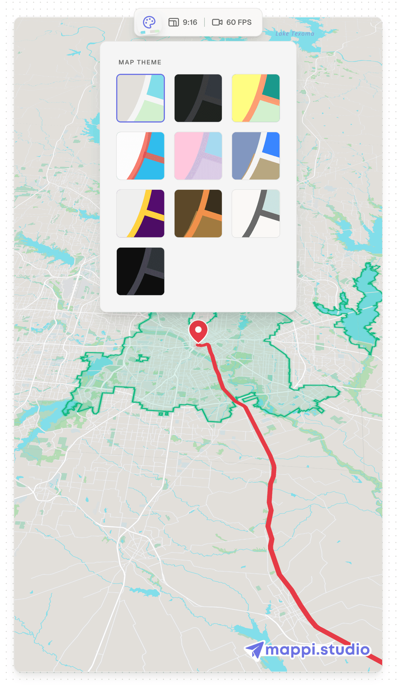
- Pick the closest preset in the Style panel. Open the Style panel and choose the preset nearest to your intended look. Decide on mood first: dark presets read as cinematic and premium, light presets read as clean and editorial.
- Set the land and water colors first. These two colors cover most of the frame at any zoom level, so they define the whole palette. Keep clear contrast between them; coastlines are how viewers orient themselves on a map.
- Recolor roads and borders to a supporting role. Roads and borders are texture, not the subject. Shift them a few steps toward the land color so they stay visible without competing with your route line and pins.
- Tune label color for contrast. Labels must be readable at a glance on a moving map. Test the label color over land, water, and your densest city area, and adjust until all three pass.
- Press play and watch a full leg. A style that looks good on a still frame can fall apart in motion. Preview a complete route leg and confirm the route line and pins stay separated from the background the entire way.
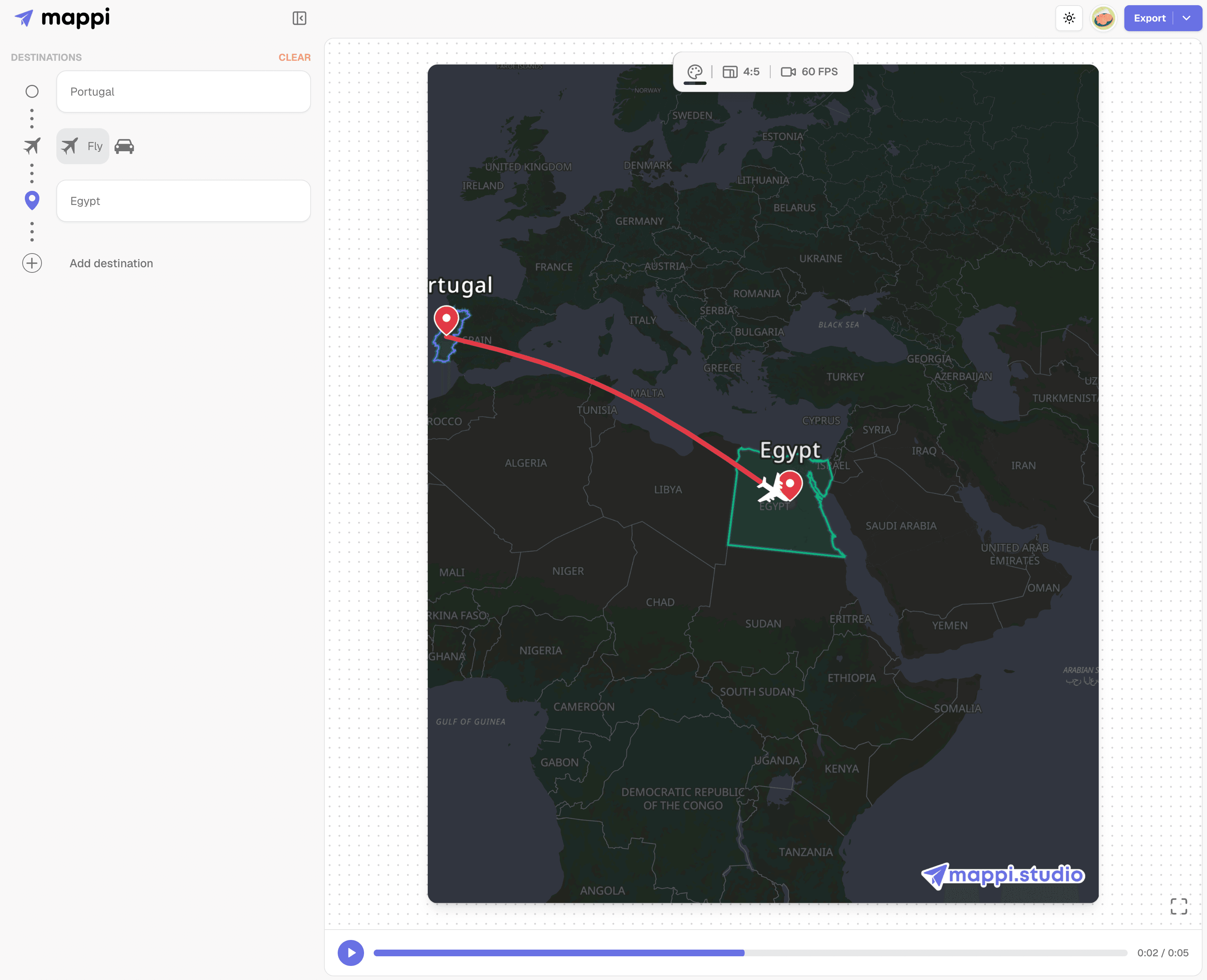
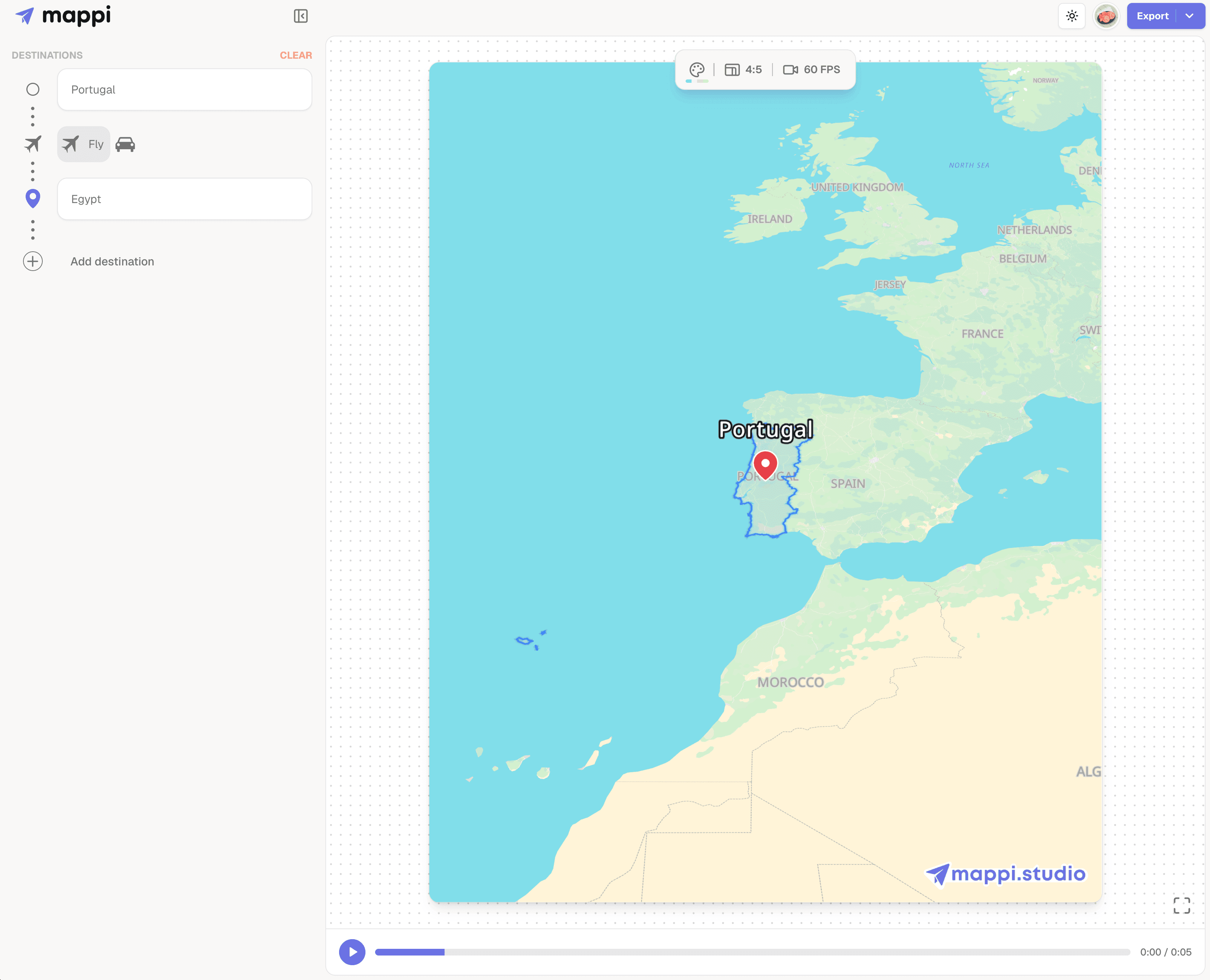
Matching a brand without hurting readability
Brand-matching a map does not mean painting every layer in brand colors. It means placing the brand where the eye already goes: the route line, the pins, and one or two accent layers, on top of a neutral base that flatters them. If your brand color is a saturated orange, an orange route over a muted dark base looks intentional; orange land with orange roads looks like an error. Borrow the logic of good title design, where the accent color gets five percent of the frame and earns all of the attention. Save your custom style decisions somewhere consistent, because reusing the same palette across every video is what makes a channel look art-directed rather than assembled. A simple note with your land, water, route, and pin colors is enough to rebuild the look in any future project in under a minute.
Styles that serve the story
The best style choice depends on what the animation is for. Travel recaps want warmth and a route line that pops. Documentary-style openers want dark, desaturated bases with muted labels. Explainers and news-style maps want stronger borders and clearer labels, since geography is the actual subject. Decide the job first and the color decisions become obvious. If you are building your first project end to end, style is step three of the workflow in our step by step map animation guide, sitting between the route work and the export.
What to do next
With a base style in place, the next layers are highlights and pins: animated country outlines and destination markers that sit on top of your palette. Browse our map animation tutorials for those guides and the rest of the series as it grows.
