


The Nonprofit's Guide to Animated Impact Map Videos
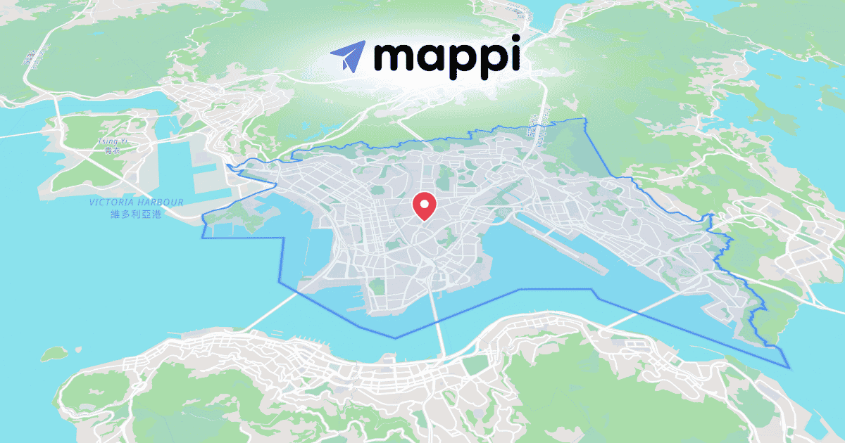
"We work in twelve districts across three countries" is a sentence donors forget. A map where those twelve districts light up one by one is a story they remember at pledge time.
Light up your project regions
Open the Regions tab in the editor's search bar and use Region Selector to click each country, state, or district where you operate. Each one gets an animated fill and fade-in. Sequence them so the program footprint grows on screen while the narration lists it.
Pin the numbers to the places
Impact stats land harder when they're attached to geography. Click a pin, open the Text panel, and use Label Styler to add a callout like "4,200 wells drilled", timed to reveal with the voiceover. One number per place, shown as the camera arrives. That beats a slide full of statistics every time.
What impact maps work best
Program footprints, with regions lighting up as the years pass.
Conservation stories, like the great wildebeest migration crossing the lands you protect.
Flyway protection, told through bird migration routes as animated videos.
The same one-minute video works in the annual report, on the gala screen, and on social. Build it once and reuse it everywhere. If your story follows a journey (a supply chain, a refugee route, a river restoration), build it stop by stop in Route Builder and let the map make the case.
Continue reading
Mapping the Great Wildebeest Migration as an Animation
Animate the Serengeti-Masai Mara circuit as a seasonal loop: park highlights, river-crossing moments, and a route that ends where it began.
Mapping Bird Migration Routes as Animated Videos
Animate the arctic tern's pole-to-pole journey: wandering flight paths built stop by stop, softened with easing until they feel alive.
