


How to Match Your Map Style to Your Brand Colors
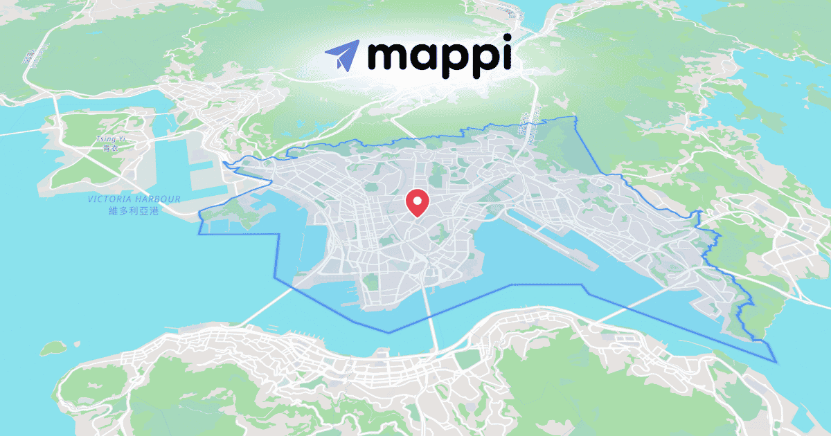
A map in default colors looks like a screenshot. A map in your palette looks like part of the campaign. The difference takes about ten minutes in the Theme panel, and you only pay that cost once.
Pull your palette into the map
- Open Theme Studio in the right panel and start from whichever preset is closest to your brand's mood, whether that's light, dark, or muted.
- Paste your brand hex codes and assign them deliberately. Land takes your background neutral, water gets a deeper cousin of your primary, and roads carry an accent that stays readable at every zoom level.
- Save the result as a reusable theme so every future project starts on-brand instead of on default tiles.
Match the type, not just the tiles
Recolored tiles under default type still read generic. Click any label, open Label Styler, and set fonts and label colors to your brand guidelines. The halo color matters more than you'd think against tinted land.
Where an on-brand map pays off
A saved brand theme carries ads, listings, and social clips alike. See the marketer's guide to map videos for social ads for campaign workflows, or the real estate agent's guide to animated map videos for listing-ready examples.
Once the palette is locked, those exact colors reach the final file untouched thanks to Mappi's frame-accurate render engine.
Continue reading
Theme Studio: Design Custom Map Styles in Minutes
Presets plus a full editor for land, water, roads, borders, and labels. Theme Studio turns any map into a style that is unmistakably yours.
The Marketer's Guide to Map Videos for Social Ads
On-brand map ads without a motion designer: brand-colored themes, AI-drafted first cuts, and one project exported to every ad placement.
